Academic writing and business writing are not at all the same. Granted, they have some similarities, but they differ in some very crucial ways. If you try to make a business presentation as if it were an essay on thermodynamics, it’ll probably fall quite short. To be fair you probably wouldn’t be presenting an essay with PowerPoint slides, but the fact remains; writing up a good business presentation or webinar utilizes different skills and concepts than writing a good essay.
However, there is one important thing the two have in common; you have to know what you’re talking about. Whether it’s stating an opinion or selling a product –especially selling a product- you have to be knowledgeable enough about your topic to inspire confidence in your audience. That’s how you convince people that your business plan is worth investing in. These tips provided by PowerPoint presentation experts from this site will help you inspire that confidence in the ones you’re presenting your business plan to.
Concision and Keywords
Academic papers want you to be concise, yet still, explain your reasoning behind points and arguments. Business presentations don’t need that. All that matters are facts. You need to state what your product is, why it will work, and how you plan to sell it, but meaningless fluff about why you feel the way you do isn’t necessary. After all, saying that you ‘feel’ your product is valuable isn’t exactly inspiring to investors. They want to hear that you ‘know’ it is valuable, and why you know it.
That said, being concise also means using keywords. Keywords should encompass the most important parts of your presentation, representing the crucial points. With a handful of keywords, you can cut down on how many words are on each slide; which is important for keeping clutter down and making your slides easy to read and comprehend.
Professionalism is Crucial
You may be tempted to play around with some of PowerPoint’s more creative features; special animations, unique slides, or certain fonts. Naturally, you should avoid these temptations as best you can. Not that having slide animations of any sort is wrong, but spiral whirls or spinning headline style transitions aren’t the best representation of professionalism. As for slide styles, ones that organize your information as cleanly as possible are most important, with vital info higher up on the slides for people further back to see. Naturally, you should avoid unusual or gimmicky fonts, or adding awkward clip art that draws attention away from your major points. Finally, don’t pick backgrounds, whether they are solid colors or pictures, that make it difficult to read the actual text on the slide! The following is a great example of a good slide and a bad one.
The slide on the left is too cluttered. You’ll probably even note here in this article that it is difficult to read compared to the one on the right. That’s because there’s simply too much going on. Too many words, too many graphs, too many points all in one place. The slide on the right is good because it’s visually distinctive, drawing attention to the main point, but also simple and clean enough for a reader to easily digest. This type of design choice is just as important in a business presentation. Remember, the slides are giving the presentation; they just provide enforcement of crucial points for the audience as you speak.
Use of Graphs, Charts, Etc.
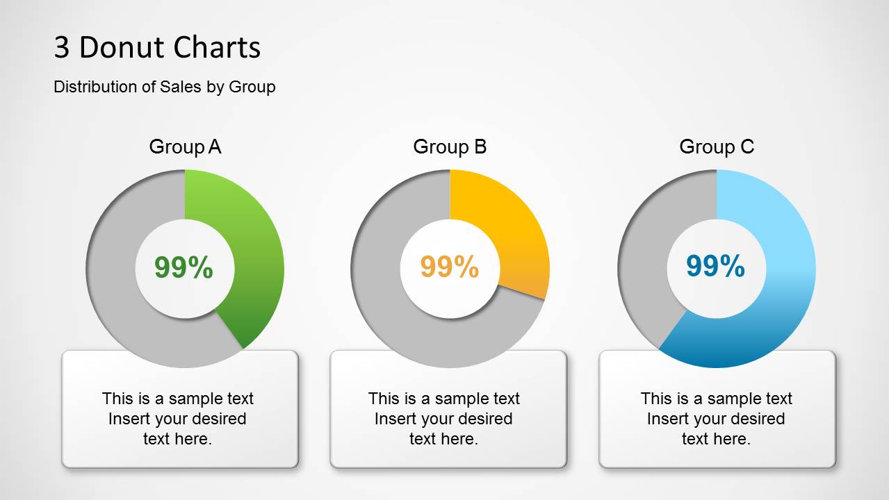
This may seem a little hypocritical since we just condemned a slide with many graphs, but graphs and charts are actually quite useful and even recommended in a business presentation. That’s because any good business presentation will likely involve the topic of sales projection, target demographics, or something similar. These types of topics will often include a lot of numbers, and that’s difficult for people to remember when they’re just hearing them all verbally. However, to avoid the type of slide presented above, you should generally limit a graph to one slide or chart at a time, and not accompany it with a lot of text that’s not part of the graph. You can put more than one graph on a slide if you need to, but make sure they are visually distinctive and clear from one another, and that their presence doesn’t clutter the slide to such an extent that the reader has problems following any particular one. The following is a good example:
There are three charts on this one slide, but all of them are visually distinctive and easy to read separately. It’s much cleaner and easier to follow than the previous example.
Balance and Moderation
Finally, remember that you aren’t just selling a product, you’re selling an idea: the idea of a better service or technique or means of accomplishing something. And while you need to know all the scholarly points of your product, you also need to throw in some real passion and enthusiasm for the idea you’re selling as well. If you give a long-winded lecture on your product, everyone will be bored. But if you just prattle on about your ideas of changing the market or the world, people will think you’re just naïve and don’t know how things really work. Don’t go off the deep end on either; balance facts about the product and passion about the idea to both inspire confidence in the product’s validity and keep the interest of your audience. In the end, a good business presentation is about selling a product and an idea, and the best way to do that is to convince people that what you’re selling is both exciting and profitable.